

When it comes to delivering a presentation, a well-designed presentation slide deck can make all the difference. Whether you’re presenting to colleagues, clients, or investors, a strong presentation slide deck can help you communicate your message effectively and leave a lasting impression. This is why it is critical that you adopt the best practices while creating your presentation slides.
However, designing a good PowerPoint presentation slide deck can be a bit tricky. It isn’t enough that your PowerPoint presentation slide deck is visually appealing, rather, it should be formatted in a way that the key messages stand out.
In this article, we will discuss several PowerPoint presentation tips and strategies that you can use to improve your presentation slide deck. The presentation tips will help you create a more engaging and impactful presentation. For this blog, we will go look at some presentation slide examples and then highlight how these slides can be improved.
Before we start, we suggest you go over our comprehensive guide on creating a consulting presentation. Consulting presentations are often considered the gold standard in business presentations for several reasons. They are highly informative and provide clients with valuable insights and recommendations based on the presenter’s expertise and experience. Additionally, consulting presentations are designed to be persuasive and engaging, as they aim to persuade clients to take action based on the recommendations being provided. The use of data, charts, and other visual aids in this type of presentation also adds to its effectiveness, making it easier for clients to understand complex concepts and ideas. Overall, consulting presentations are a powerful tool for businesses and professionals and are an effective way to deliver complex information and recommendations to clients. Therefore, do refer to our guide to learn how to create an effective PowerPoint presentation.
With that said, let’s get to the main point of this article: Presentation tips on how to create good PowerPoint presentation slides (with slide examples)
Point 1: Write the right action title
Let us look at the first example. This ppt slide essentially captures the growth of Pakistan’s international bandwidth usage from 2011 to 2021. This is an insightful PowerPoint presentation slide that can deliver the message. The slide has most of the important elements, and the chart is formatted perfectly to deliver the key message. The presenter has used elements to show the average growth. All in all, the slide gives some solid information.
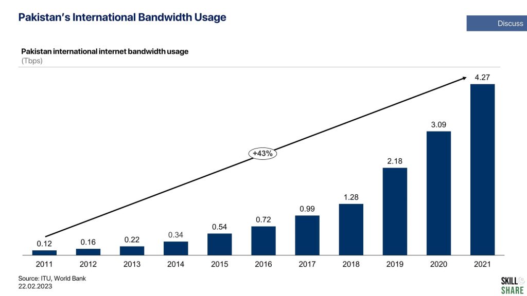
However, there’s one aspect that is fundamentally incorrect: the slide does not have an appropriate action title. An action title is the slide header, which summarizes the content of the slide in one precise sentence. The idea of the action title is that if a reader skims through the slide deck and only reads the action titles, he or she should understand the key messages of the entire presentation.
A better way to write the action title for this slide would be to capture the key message in a sentence. So in this case, the action of the slide could be:
On an aggregate level, Pakistan’s internet bandwidth usage has grown at a CAGR of ~40% over the last 10 years.
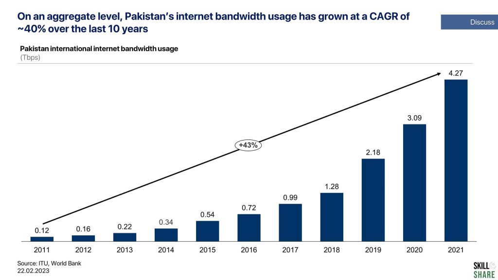
Notice that in our action title example, the graph was fairly simple to analyze, and therefore, you can get away with just putting the chart title as the header. However, there are cases where the analysis is far more complex and complicated and requires significant effort to understand. In such cases, it becomes much more crucial for you to choose the right action title. Here’s another action title example:
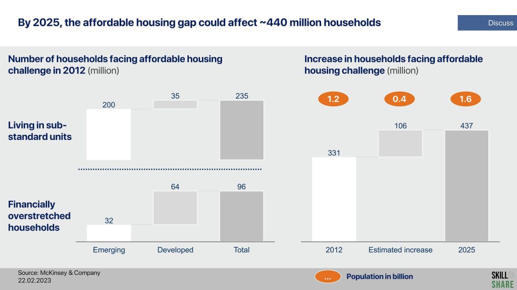
The sample McKinsey slide highlights the global affordable housing challenge and extrapolates the existing data to show how grave the problem could be in 2025. A poor action title for this slide would simply mention that this slide has data on the affordable housing gap.
However, a better action title for this slide would specify precisely what the housing challenge is:
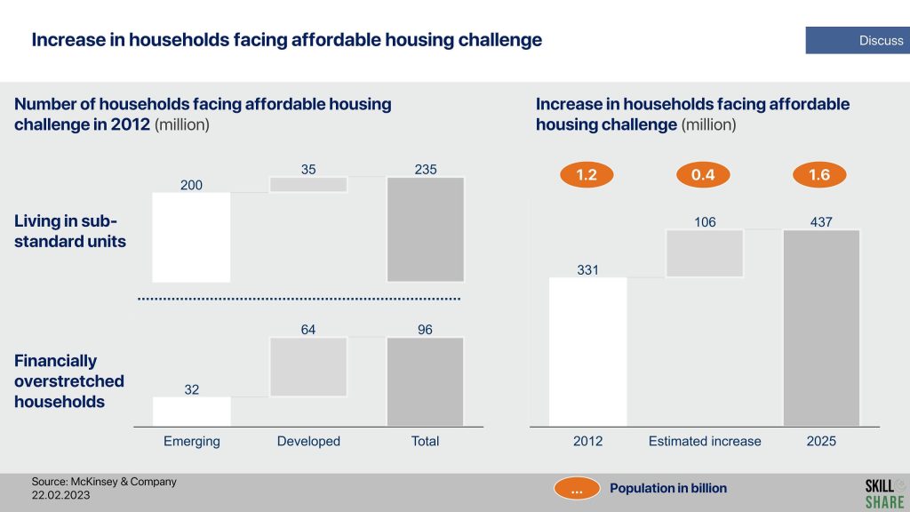
By 2025, the affordable housing gap could affect ~440 million households

In this action title example above, you would notice that the data on the slide was slightly more complex than in action title example # 1. It wasn’t as intuitive and would have taken a considerable amount of time for the reader to fully absorb it. Therefore, it is imperative that you develop the proper action title for the slide, which gives the key message of the content of the slide and makes it clear for the audience right away. The charts on the slide should serve as supporting material for the slide’s action title. Therefore, writing the right action title is crucial to create a good PowerPoint presentation.
Point 2: Alignment & Consistency
So here is another example. This presentation slide shows a simple demand and supply chart. Without going into the specifics of the economic theory, let’s just analyze what is wrong with this slide and how it can be improved. The first impression is that this slide looks kind of messy. So the question is, why does it look messy?
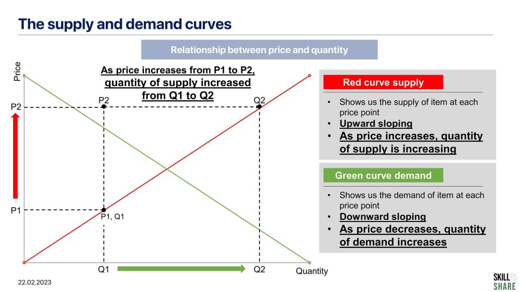
Font consistency
The main reason is that this page uses all kinds of different font sizes. And this is a problem that you see quite often. So often, people disregard the importance of consistent font sizes, and as a result, their slide presentations look appalling. So in this case, the action title seems to have a font size of 28; the section title is a bit smaller and is 24. The ‘Red Curve’ title is 18; the font in the first bullet is 16, while the other bullets are 20, bold, and underlined. Similarly, in the chart section, the axis titles have a different font, as do the pointers marked P1, Q1, etc., all of which seem to have a different font. All of this significantly adds to the unclean and unorganized look and feel of the slide.
So you must ensure that you follow a consistent font size. The key rule here is that everything except the title and the footnotes must have the same font size. You can keep a bigger font for the action title, but as for the rest of the body, make sure that you have consistent font sizes.
Chart formatting
Now let’s look at the chart. The first thing that pops into my eyes is the thick dotted lines. You don’t want these lines to be so dominant. So the suggestion here is that whenever you make dotted lines, make them lighter so that they appear in the background
The second problem in this chart is that the supply and demand curves have two different colours with no legend provided for clarity. So the fundamental rule here is to always provide legends whenever you use multiple colours on the same chart.
By the way, if you ever struggle while choosing the right chart type for your presentation or any analysis, you will find our detailed guide on chart selection quite helpful. It discusses different types of charts and highlights the best chart to opt for given the analysis that you want to perform. Oh and, if you want to learn how to format charts the right way, you must check out our detailed guide on how to format charts to convey key insights effectively.
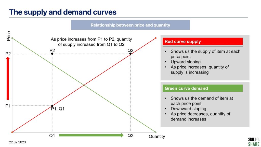
Point 3: Refine the layout
Now let’s look at another example of a PowerPoint slide. This slide has followed the main fundamentals of slide writing. The fonts used are consistent, and the slide does look neat in its layout. However, there are two main things that can be incorporated to enhance this slide further.
Firstly, it is a bit unclear what we are looking at. What elements are these exactly, and what is the title or the organizing principle? Sure, the action title helps us infer what the slide is about, but it would be better if there was a subheading that made it clearer for the audience to understand what exactly he is looking at.
The other thing that could be done is to add separator lines, which can be added between the elements to make the slide look more organized.
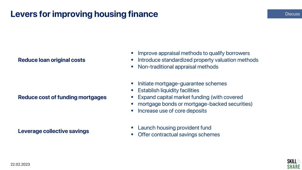
Point 4: Animations and Graphics
Now let’s look at the next slide. Here, the immediate thing that will be pointed out is the use of too many different colour and unprofessional illustrations. This also ties in with the point discussed above, maintaining consistency with font size and style. Using too many different colours does not add to the actual content or meaning of the slide. In fact, they look unprofessional and take away the impact of the slide, and the actual meaning of the things that you want to say with your slides gets completely diminished.
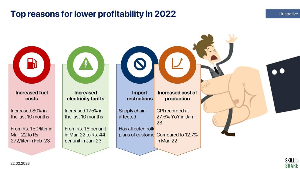
In addition, if you notice that some of the things have cluttered onto one another, that is because the presenter had built-in animations. However, since this slide isn’t being presented as a PowerPoint but as a PDF, the formatting has really been messed up. Similarly, in the event that a slide is printed and circulated, this is how it would appear on the slide.
Therefore, by all means, avoid using animations for professional presentations, and certainly not for slides presented to c-level management. You will be perceived as unprofessional, and that is just not what is expected of you.
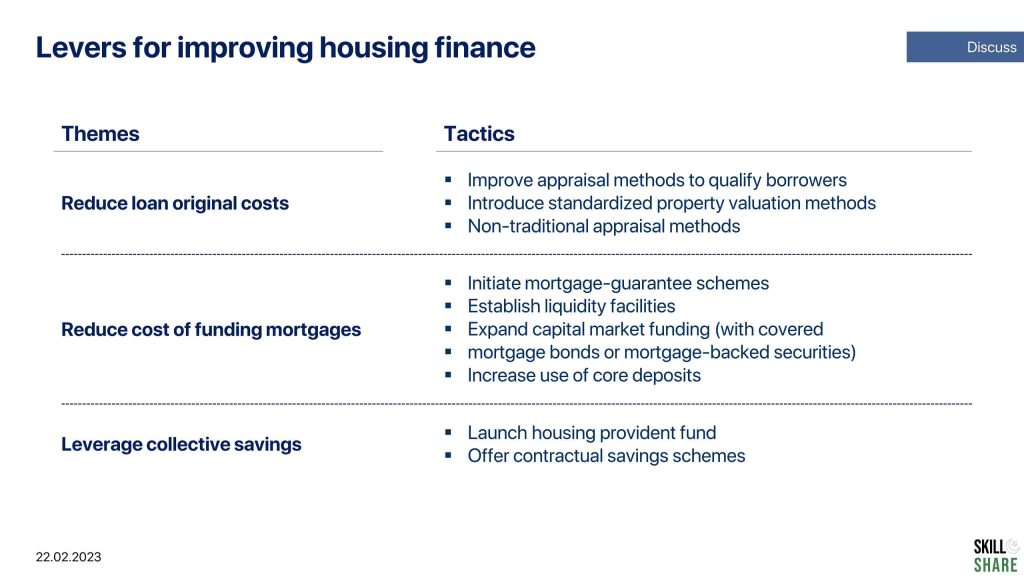
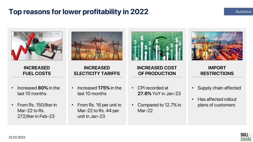
A more professional way to design this PowerPoint presentation slide is this:
Conclusion
In this article, we have gone over some of the key PowerPoint presentation tips that can help you create a good PowerPoint Presentation. While there are many more PowerPoint design tips that you can apply to your slides to create a good PowerPoint presentation, however for this article, these presentation tips will suffice. We will explore more PowerPoint presentation tips in a series of subsequent articles and blogs on PowerPoint presentation templates, PowerPoint presentation ideas and other PowerPoint presentation tips that you can adopt to create killer presentations.
Lastly, we suggest you explore our article on MyKinsey pyramid presentations structure and presentation storytelling to learn a good deal about making impactful slide decks.