

A McKinsey presentation is a communication style used by McKinsey & Company, one of the world’s leading management consulting firms. Management consultants work with some of the top corporate entities or governments, which spend thousands of dollars to get their advice. Management consultants conduct extensive research, collect data, synthesize that data, and present their comprehensive analysis. Therefore, management consultants have to ensure high-quality output, and the success of the entire project depends upon their presentation to the clients. This is why their presentation slide decks have to be impeccable, and this is where consulting presentation principles come into play.
When it comes to the best consulting presentations, the McKinsey presentation deck is the gold standard. This presentation style emphasizes a clear and concise message, logical structure, and data-driven analysis. The importance of a McKinsey presentation lies in its ability to convey complex ideas and data in a simpler and more effective manner. It helps the presenter present ideas in a logical and organized way, making it easier for the audience to follow and comprehend the information. In addition to the consulting industry, business leaders, entrepreneurs, as well as policy-writers use the McKinsey presentation style.
One of the key features of a McKinsey presentation deck is the use of the McKinsey Pyramid Principle. The McKinsey Pyramid Principle states that the main message of the presentation should be presented first. This should be followed by supporting arguments and evidence, and the presentation should be organized in a logical structure. The pyramid structure ensures that the audience understands the most important point first and then follows a logical path to support the main message.
Moreover, the McKinsey presentation slide deck also uses the MECE (mutually exclusive, collectively exhaustive) framework. This framework ensures that all relevant points are covered in a presentation without any redundancy.
In addition, the Mckinsey presentation deck also includes insightful charts and analysis, which are formatted to perfection. All of these ensure that the insights are effectively delivered to the audience and create an impact.
In this article, we are going to discuss all of these, with McKinsey slides examples, to really show you how to create a McKinsey presentation deck.
Create McKinsey Presentation Deck: Understanding the framework
A presentation framework is a structure that serves as a guide or a roadmap for the presentation. A framework provides a logical sequence for organizing ideas, data, and visuals, and makes it easier to create a coherent presentation that communicates key messages effectively.
MBB consultants mostly incorporate two commonly used principles in their McKinsey presentation deck: the Pyramid Principle and the MECE principle. The Pyramid Principle suggests presenting the main message first, followed by supporting arguments. The MECE principle ensures that all relevant points are covered without redundancy. This is achieved by breaking ideas into mutually exclusive categories that collectively cover the entire topic.
McKinsey Pyramid Principle
The Mckinsey Pyramid Principle enhances the clarity of suggestions, ideas, and business recommendations. As a result, it improves the flow of the presentation and makes it more impactful.
The McKinsey Pyramid Principle is not only used for the McKinsey presentation deck but is used at almost all of the top consulting firms. The McKinsey Pyramid Principle suggests that you begin with the answer or conclusion. Then present the arguments that led to that conclusion, as well as the data that supports them.
Generally, most people structure their presentation slide deck in this way:
Slide 1: Problem identification
Slide 2: Data point 1
Slide 3: Data point 2
Slide 4: Data point 3
…
Slide X: recommendation
However, structuring your presentation deck like this can lead to problems:
First, the reader has to keep multiple insights and thoughts in their minds without any context or idea of where the argument is leading. This makes it easier for them to lose their attention and lose track of what is being discussed.
Secondly, when you structure your presentations like this, you are diving straight into the details. Oftentimes, the reader is more concerned about the answers and recommendations than the details. This is particularly true for C-level executives.
On the other hand, management consulting firms, particularly McKinsey, structure their presentation decks using the McKinsey Pyramid Principle.
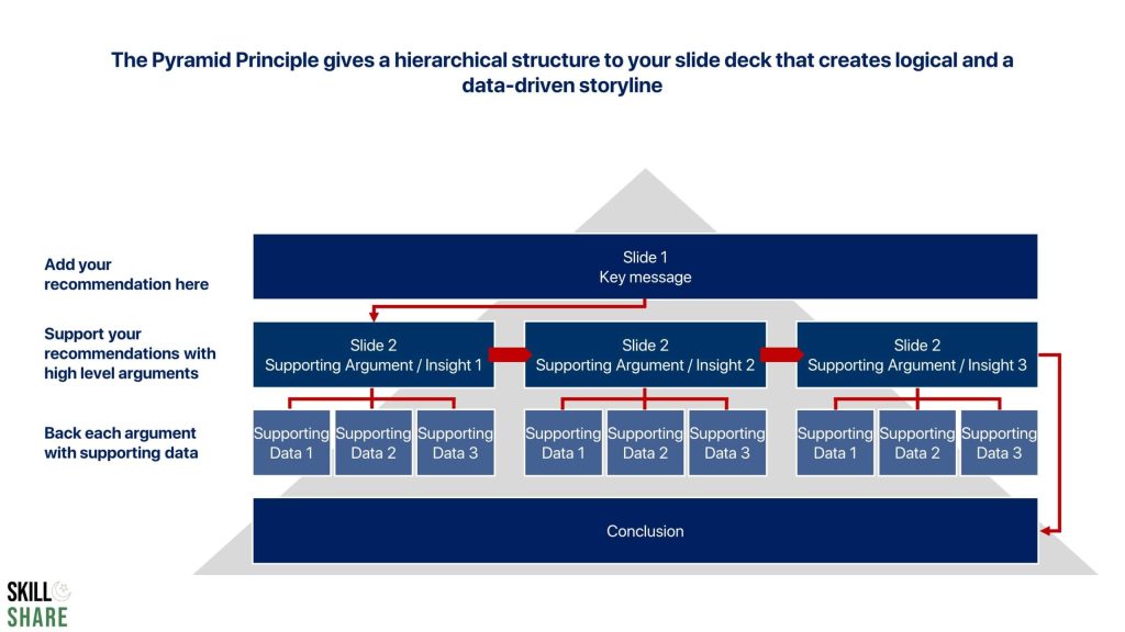
The McKinsey Pyramid Principle gives a hierarchical structure to the presentation deck that creates a logical and data-driven storyline. Using it, the presentation should start with an introduction that states both the issue as well as your answer or recommendations for that issue. This is essentially your key message.
This key message is supplemented by supporting arguments that create a logical storyline and result in a more impactful presentation. Each supporting argument is data-driven, therefore, making the arguments much stronger.
Here are the core elements of the McKinsey Pyramid Principle:
Lead with the answer: make your recommendation(s) right away;
Support the answer with key facts and insights at a high level: synthesize your analysis to support your recommendations;
Back key insights up with detailed data, analysis, and evidence: These slides will include the detailed analyses that you perform and the summaries of the evidence that you gather.
MECE (mutually exclusive, collectively exhaustive)
The MECE (mutually exclusive, collectively exhaustive) framework is a tool used in business communication to ensure that ideas are organized in a logical and comprehensive manner. The MECE framework is commonly used in McKinsey-style presentations to ensure that all relevant points are covered without redundancy.
The MECE framework requires that ideas are organized into mutually exclusive categories that collectively cover the entire topic. This means that each category should represent a distinct and non-overlapping aspect of the topic. This ensures that the ideas are well organized and that there is no overlap between different categories.
To achieve MECE, it is often helpful to break down the topic into smaller, more manageable components. For example, if the topic is “strategies for increasing sales,” it may be broken down into “product-based strategies,” “customer-based strategies,” and “marketing-based strategies.” Each of these categories should be mutually exclusive and cover the entire range of strategies for increasing sales.
The MECE framework is beneficial because it helps presenters avoid redundancy and ensure that all relevant points are covered. This means that the presentation is more efficient, and the audience is more likely to understand the key messages. Additionally, the MECE framework can be used to create more visually engaging and memorable presentations by grouping ideas into logical and coherent categories.
Overall, the MECE framework is an essential tool for creating effective business communication, especially in McKinsey-style presentations. By ensuring that ideas are organized into mutually exclusive categories that collectively cover the entire topic, presenters can create more efficient, engaging, and memorable presentations that effectively communicate key messages to the audience.
Create McKinsey Presentation Deck: Action titles
Action titles are a key component of a McKinsey presentation deck. Action titles are short, clear, and action-oriented slide headers that organize the presentation deck and guide the audience through the presentation. Action titles serve as punchlines that help the audience follow the presentation and understand the key messages.
Action titles are important for several reasons. First, they help to organize the presentation into a logical and easy-to-follow structure. By breaking the presentation down into smaller, more manageable parts, the presenter can ensure that the audience stays engaged and focused on the key messages. This also helps the presenter to avoid redundancy and ensures that all relevant points are covered.
Second, action titles help to focus the audience’s attention on the most important parts of the presentation. By using action-oriented language, the presenter can emphasize the key messages and encourage the audience to take action or make decisions based on the information presented.
Finally, action titles help to create a more engaging and memorable presentation. By using short, clear, and action-oriented language, the presenter can create a sense of urgency and excitement around the key messages. This helps to keep the audience engaged and motivated throughout the presentation.
Overall, action titles are an important tool for creating effective McKinsey-style presentations. They help to organize the presentation, focus the audience’s attention, and create a more engaging and memorable experience for the audience. By using action titles effectively, presenters can ensure that their message is heard and that the audience takes the desired action.
The idea of using action titles is that if a reader simply reads through the slides and only reads the action titles, without looking at any other content of the slide, he should understand the key messages of the presentation deck.
Here is a McKinsey slide example that shows how to write the perfect action title.
You can also check out our comprehensive article on action titles to really understand how they can be used. It also has more action titles examples which you will find quite helpful.
Create McKinsey Presentation Deck: Graphs and charts
One of the most important elements of the McKinsey presentation deck is the charts. Almost every slide in a McKinsey presentation deck contains a chart that depicts the quantified results of research. Consultants always ground their recommendations in some sort of data, and therefore, graphs are frequently used in all MBB presentations. In fact, data-driven analysis is now the norm in almost all industries and government entities, and therefore, the use of charts and graphs to visualize that data has now become critical.
The two most commonly used charts in the McKinsey presentation deck are the column charts (or bar charts) and the waterfall charts.
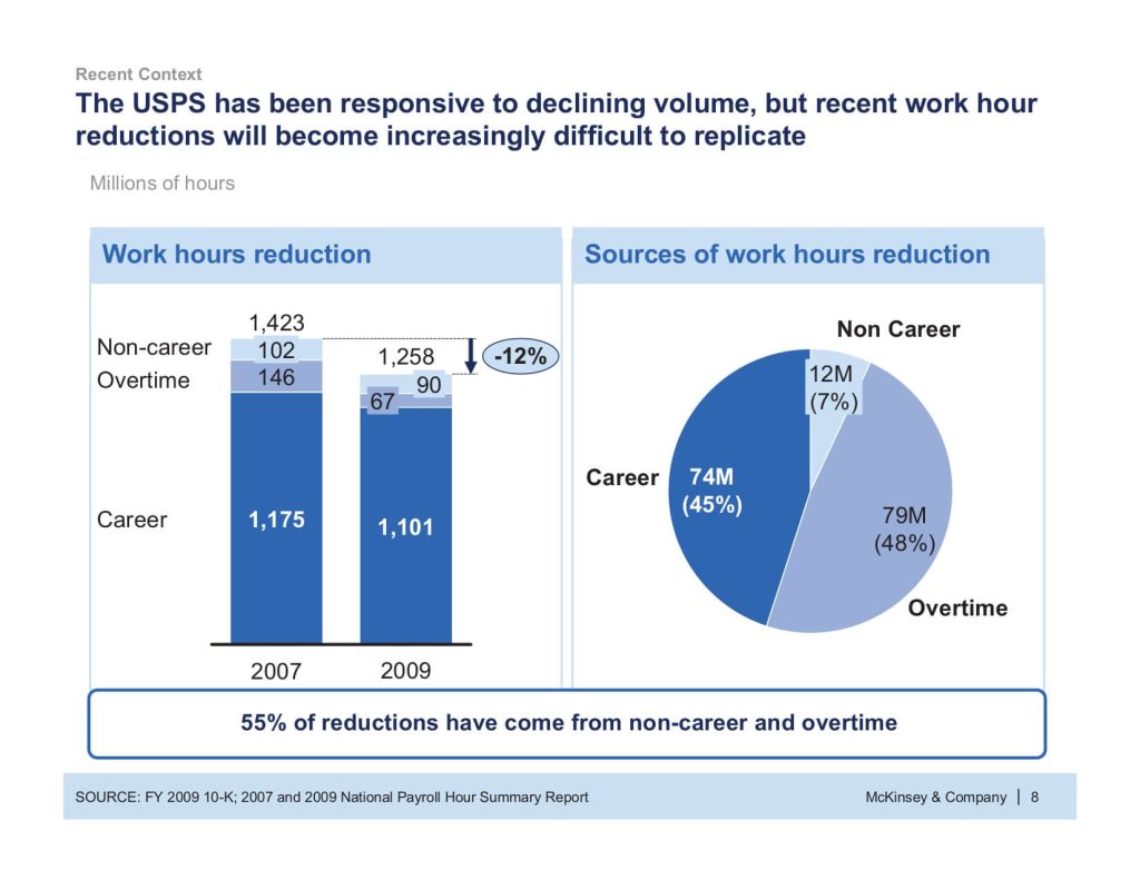
Bar graphs and column charts (as well as the stacked column charts)
Bar graphs are visual representations of data (usually grouped) in the form of horizontal or vertical bars, with the length of the bar corresponding to the data value. Bar charts are an effective way to show relative sizes. For a typical bar chart, the x-axis shows the category while the y-axis represents the value for those categories. Here is an example.
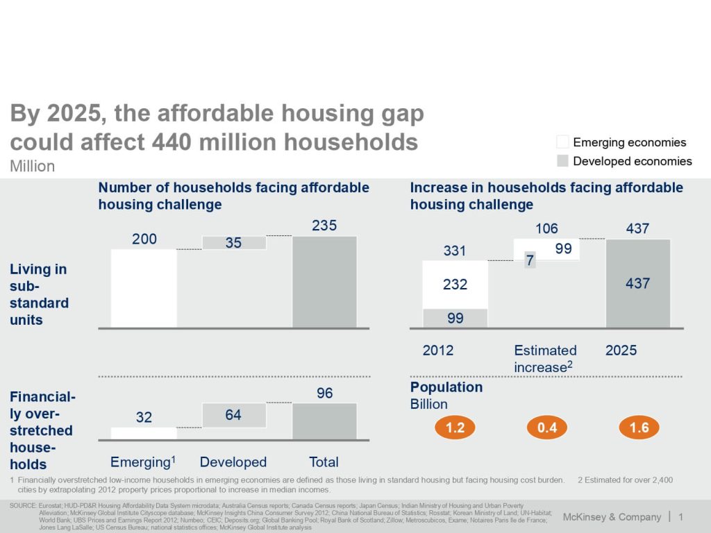
To insert a column chart or a bar chart in a PowerPoint presentation, go to “insert” and click on “chart.” This will open the box from which you can choose a column or bar graph. Here’s a McKinsey slide example which uses a column chart.
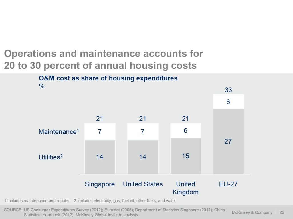
In addition to simple column charts, stacked column charts can also be used. A stacked column chart depicts the composition of each category in the total. Let’s take an example. Suppose you want to map out the sales of each category as a proportion of total sales in each year. You will use a stacked chart to plot this. For instance, here is a McKinsey slide example which uses a stacked column chart to show the breakup of O&M costs.
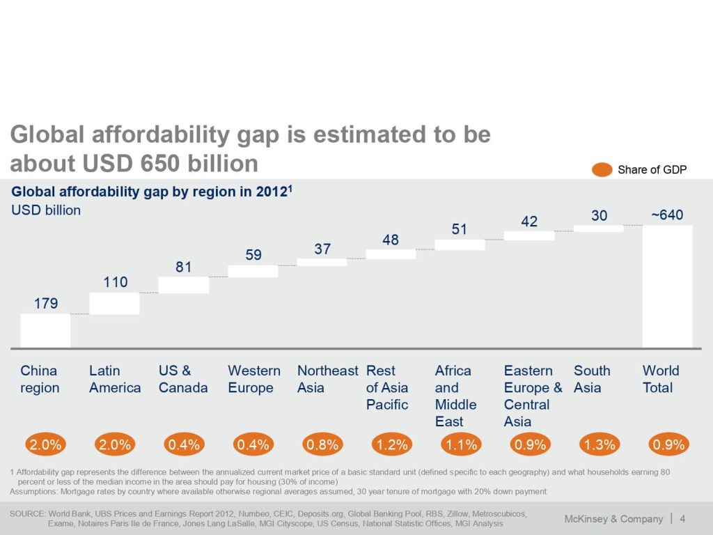
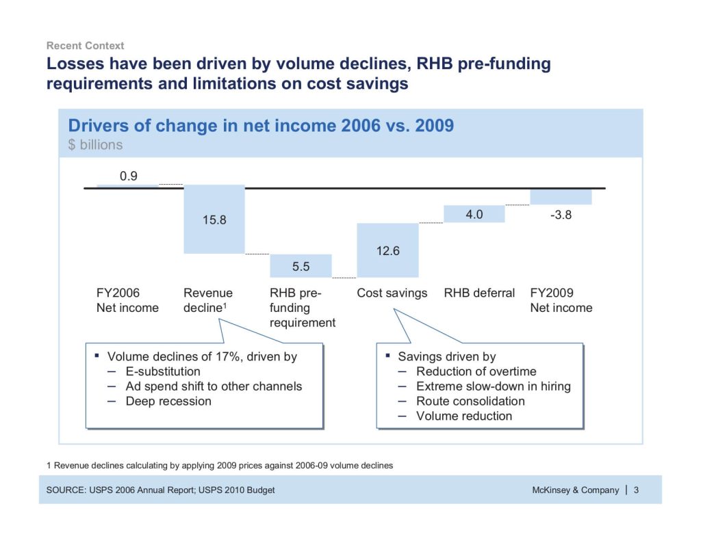
Waterfall charts
Waterfall charts are most commonly used in consulting presentations. In fact, there is rarely any consulting presentation that does not have a waterfall chart. Waterfall charts are an effective way to visualize a starting value, the positive and negative changes made to that value, and the resulting end value. In a waterfall chart, the first column is the starting value, and the last column is the end value. The floating columns between them are the contributing positive or negative values. The first column in a waterfall chart represents the initial value, while the last column represents the ending value. The positive and negative values are represented by the floating columns between them.
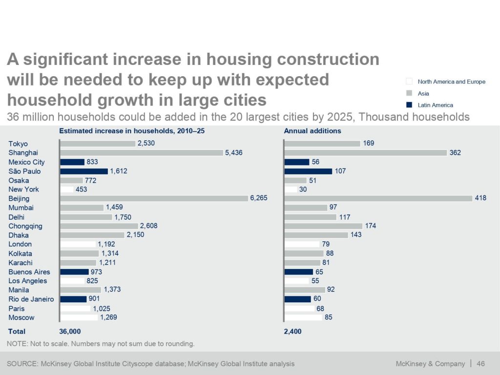
Here is a McKinsey slide example that uses a waterfall chart
If you are unclear about which chart to use in your presentation, you can go over our detailed guide on choosing the right chart for your presentation. In addition, if you want to learn how to format the chart to convey insights effectively, check out our detailed guide here.
Create McKinsey Presentation Deck: Callouts
Adding charts is the most effective way to depict data in PowerPoint presentations. However, there is more that can be done to make it even more impactful. In McKinsey presentation decks, consultants add callouts to emphasize the important messages of the slide. Here is a McKinsey slide example that shows how callouts are used in a McKinsey presentation deck to highlight a message that isn’t visible right away.
Create McKinsey Presentation Deck: Takeaway boxes
Another element that is frequently added to a McKinsey presentation deck is the takeaway box. The takeaway box is sort of a conclusion box for the slide. It is added to the slide presentation underneath or next to the chart and includes an important takeaway message from the chart. Here is a McKinsey slide example that shows how takeaway boxes are added to a McKinsey presentation slide to highlight the key message.
So while callouts are usually used to just give information on a specific element of the chart, general information that is relevant to the whole of the chart can be given in takeaway boxes below the chart. In the takeaway box, you can just include the main insights, main piece of information, or main conclusion that you want the reader or viewer to take away from the chart that you are showing.
Conclusion
In this article, we have gone over some of the ways that you can adopt to create McKinsey presentation decks. In addition, and McKinsey slides examples to help you fully understand each element and its usage. Adopting these principles and incorporating them into your presentation slide decks will help you create effective consulting-style presentations.