Charts & graphs are the most effective tools to convey key messages and insights in a presentation. As the policy & decision-makers adopt more data-centric approaches to decision-making, it becomes critical to integrate data & analytics in decision-making meetings. And indeed, the best way to present data & insights is through graphs and charts.
It is, therefore, crucial that these charts and graphs are formatted such that they are self-explanatory and easy to understand.
In this article, we will cover the most fundamental ways to format your graphs and present them in an effective way.
Step 0: Inserting the Chart
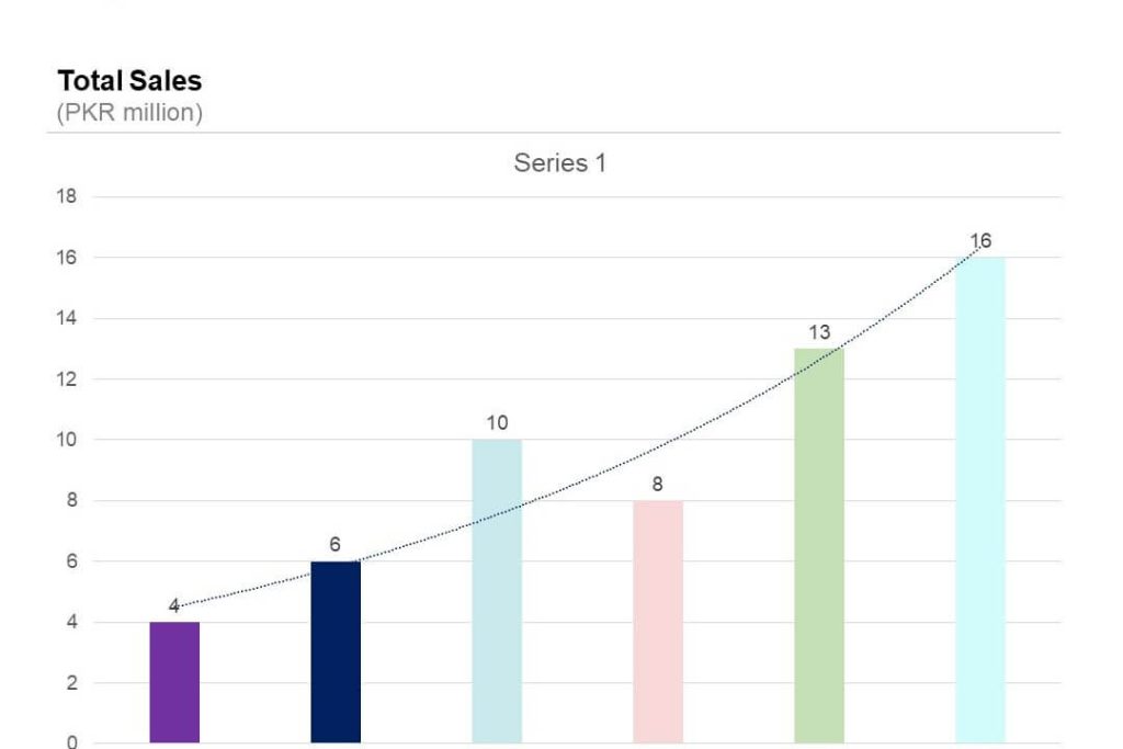
Suppose you add a new chart to your presentation. The following is how a new graph may appear in your presentation.
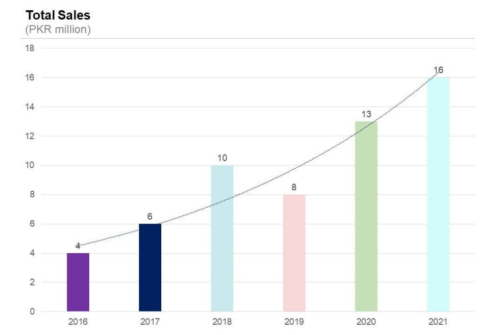
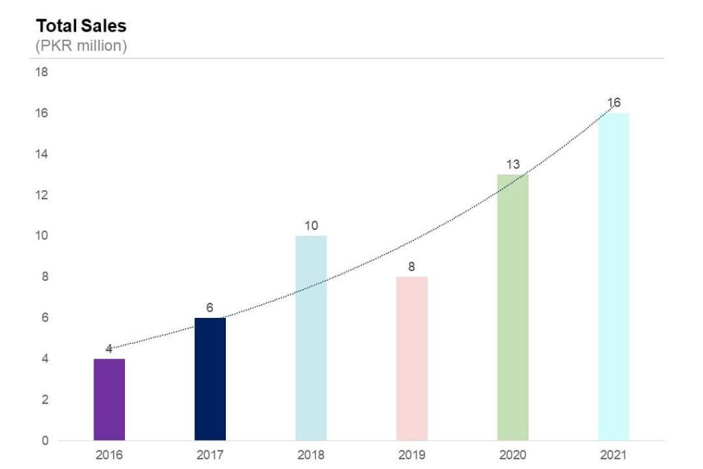
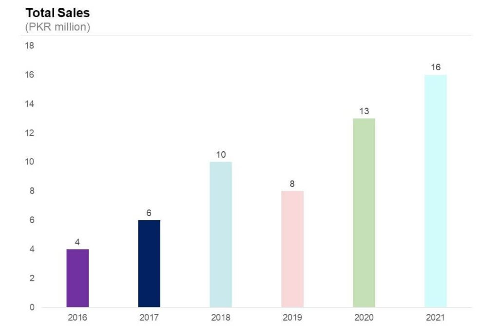
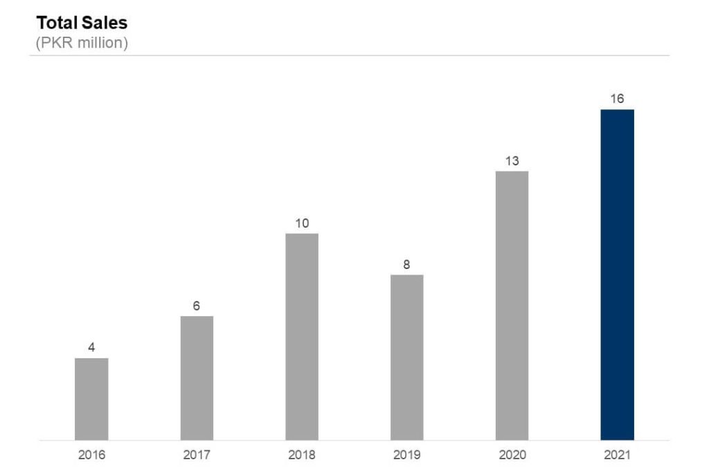
For our example, we are mapping ‘Total Sales’ in PKR millions against years (from 2016 – 2021).
The presentation will map ‘Total Sales’ on the y-axis while ‘Year’ will be mapped on the x-axis.
Note that the axis can be interchanged; you can keep it however you want.
Step 1: Remove Chart Title
The chart title is a crucial element of the chart. However, the default ‘title’ inserted by PowerPoint has limitations when it comes to formatting.
It is, therefore, advised that the default ‘Title’ is removed from the graph and instead, a textbox is inserted with the relevant text as a chart title. Textbox allows the user to customize & manoeuvre, which is pivotal when developing impactful presentations.
Step 2: Remove Gridlines
The next step is to remove the gridlines, especially when using line charts. Make your charts clean so they are easy to read and understand, and gridlines just add ‘noise’ to your charts.
Step 3: Remove Trendlines
Trendlines were a common feature used in graphs several years ago. However, now, they can be best described as cliched. The graphs are explanatory in the trend, and the line doesn’t add any valuable insight that otherwise would not be apparent from the graph itself.
Step 4: Delete Y-axis
In most cases, the value label is displayed against each bar on the chart. Therefore, having a Y-axis that essentially represents the same information is redundant.
In case you have a lot of observations and do not necessarily want to show each individual value but a general trend, you can choose to keep the Y-axis while removing the value labels against each bar.

Step 5: Tone down the graph’s colours
In a professional presentation, having a graph with multiple colours would definitely come off as unprofessional. It is therefore critical that the colours are toned down and the graph is easier to understand.
Oftentimes, management consultants use a single colour to make their presentation charts more intuitive. More specifically, if the graph represents a metric for which a higher value is better (for example annual profits), the graph bars are coloured green. On the other hand, if the graph represents a metric for which more is bad (for instance operating costs of business).
Alternatively, you can use two different colours in a chart. This can help you signify or highlight a point. See the example below:
Step 6: Add elements to highlight key messages & insights
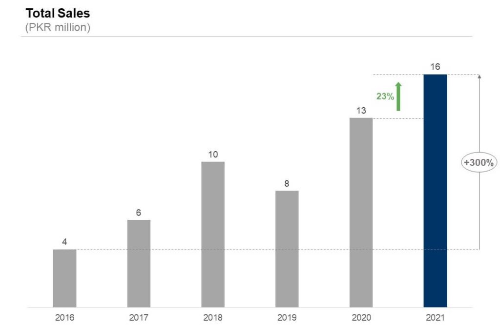
It is best to use elements and call-outs to highlight key messages and insights from the graphs. In many cases, you will be presenting your presentation to someone in the higher management, who may want to skim through the presentation instead of focusing on too much detail. Hence, using a callout to highlight the key message will instantly grab the audience’s attention, clarify the argument and make it storyline significantly more impactful.
Thanks for your blog, nice to read. Do not stop.
Nice post.
Very insightful.