
In today’s data-driven world, it is essential to communicate information effectively. Decision-makers base their decisions on evidence and data, and therefore, governments and companies collect tons of data to support their decision-making process. And hence, it is now more important than ever before that consultants and policy advisors know how to synthesize data and communicate its findings effectively. This is where graphs and charts come into play. Graphs and charts provide a visual representation of data and make it easier to understand and analyze. They can help you tell a story with your data. It can spot trends and patterns and make complex information simpler and more understandable. Whether you’re creating a presentation for a client or a report for a project, it is essential that you learn how to choose the best chart for your data or presentation.
However, we frequently find ourselves aimlessly glancing at a blank presentation slide, pondering what the ideal chart would be to depict the information that we want to present. And indeed, it can be difficult to figure out how to translate your data into a compelling chart.
Worry not! In this article, we’re going to show you how to choose the best chart that reflects your data and insights.

Why create graphs?
Graphs and charts visually represent data and information. They help understand patterns, relationships, and trends in the data and interpret them easily. Additionally, graphs can also make it easier to compare data sets, spot outliers, and make predictions based on the available information. Whether it’s a bar graph, a line graph, or a scatter plot, graphs allow people to quickly and easily understand the insights generated from data. This makes them an essential tool in a wide range of fields, including business, science, and technology.
Bad charts can be confusing
Let’s start by emphasizing that it’s essential that you choose the best chart for your data.
The purpose of your slide deck is to convince your audience and help them reach a conclusion. As a result, your presentation slide deck must have a compelling storyline so that the audience can logically reach the conclusion you’re attempting to provide. This gives each slide a very specific role, and overall, this will form the basis of the structure of your presentation. Henceforth, the charts on each slide should support different points of your argument.
So if you choose the wrong chart for your data, the reader could lose the flow of your argument, and your arguments will not seem impactful or compelling.
Therefore, it’s imperative that you give it considerable thought and opt for the most appropriate chart to communicate your point of view and the data that supports it.
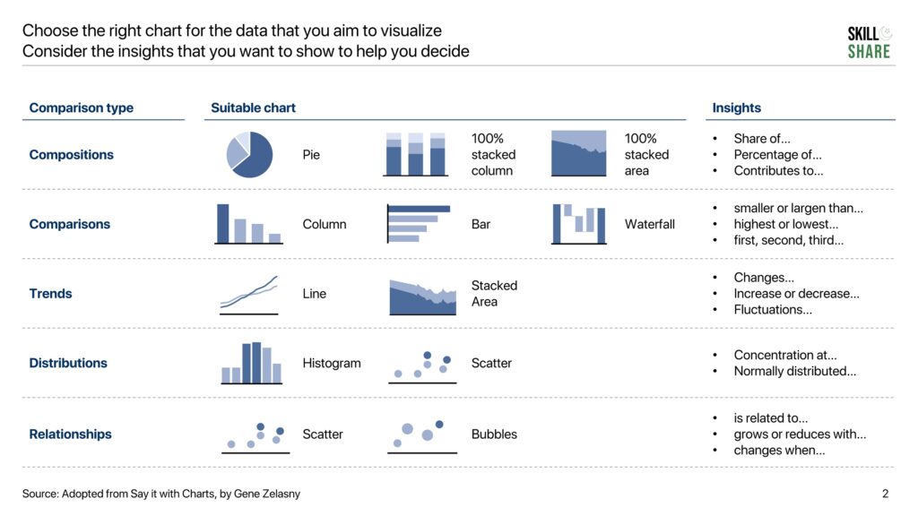
Comparisons and the insights they give
Graphs provide insights by visualizing relationships between data, patterns, trends, and distributions. However, as explained earlier, it is critical to pick the right chart so that the information can be delivered effectively. There are essentially five different comparisons that you can perform using charts, all of which provide different insights.
Relationships: How a data series is related to or changes with another data series. For example, how would an increase in tax on imported mobile phones affect their sale in the country. Typical insights include:
- Is related to…
- Grows or reduces with…
- Changes when…
Comparisons: How one data point compares to another, either across categories or periods. For example, sales in region A vs sales in region B
- Smaller or larger than…
- Highest or lowest…
- First, second, third…
Trends: How a certain variable changes or fluctuates over time. For example, how the weather & climate has evolved over the last 30 years
- Changes…
- Increase or decrease…
- Fluctuations…
Distributions: the patterns, concentrations, and spread of data across a range of values For example, grading a university class on a normal distribution
- Concentration at…
- Normally distributed…
Compositions: The breakdown of a certain data point into different components that make it up For example breakup of the costs of a company
- Share of…
- Percentage of…
- Contributes to…
To understand what type of chart you should use, you first need to figure out the insight that you want to show (e.g., relationship, composition, etc.). This will form the basis for the chart selection process.
We’ve created a decision-making map that you can use to figure how to choose the best chart for your data and presentation.
What are the different types of charts and which chart should you choose?
Now that you understand which chart to use for your presentation slide deck or Excel analysis, let us now delve into the details of each of these charts and how they can be used.
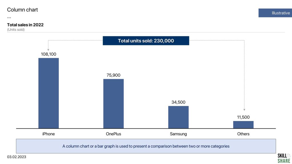
Bar graphs and column charts (as well as the stacked column charts)
Bar graphs and column charts are useful to show comparisons and compositions. In bar graphs or column charts, the length of the bar is proportional to the size of the data that it represents. A bar chart spans horizontally while a column chart is mapped vertically. For a typical bar graph, the y-axis represents the category while the x-axis represents the values for those categories. For a typical column chart, this is inverse: the x-axis represents categories while the y-axis represents values across those categories.
To insert a column chart or a bar chart on Excel or PowerPoint, go to “insert” and click on “chart.” This will open the box from where you can choose column or bar graph.
For our example, look at the column chart below, which compares the total sales made for each category in the year 2021.
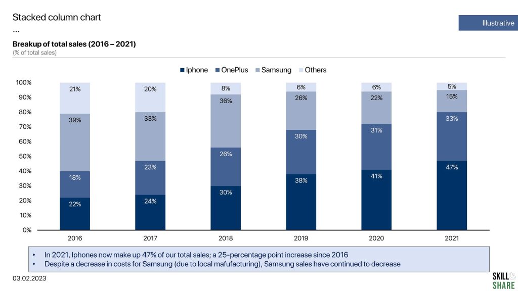
A stacked column chart depicts composition of each category in the total. Let’s take an example. Suppose you want to map out the sale of each category as a proportion of total sales in each year. You will use a stacked chart to plot this. In our example, for the year 2021, sale of Iphones made up 47% of the total sales, while OnePlus phones made up 33% of the sales, and so on and so forth.
A stacked chart helps us understand how the composition of each category changes across a time period. So in our case, you will observe that the sale of Iphones has increased in the last 5 years while Samsung’s share of our total sales has declined during this period.
Pie charts
Pie charts are an alternative to stacked column charts and are used to show compositions. The total is represented in the form of a pie, and each “slice” represents a portion of the total pie. Pie charts are used to display the composition and distribution of variables when the number of categories is small i.e. about five or six, at max.
To insert a pie chart on Excel or PowerPoint, go to “insert” and click on “chart.” This will open the box from where you can choose a column or pie chart.
In our pie chart example, we can see that iPhones made up 47% of the total sales in 2021, while onePlus phones made up 33% of the total sales.
Word of caution when you are choosing the perfect chart for your slide deck; in case there are more than six categories that you want to compare, opt for a stacked column chart as detailed above.

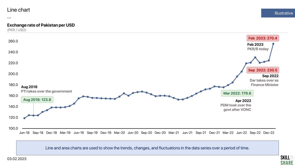
Line and area chart
Line and area charts are used to show the trends, changes, and fluctuations in the data series over a period of time.
Typically, for a line chart, the x-axis represents the time period, while the y-axis represents the magnitude of data. Line charts are mostly used to observe trends for a large amount of data, for example, stock prices, exchange rate, GDP growth and other similar data.
Let’s see a line chart example below which maps the GDP per capita of Pakistan.
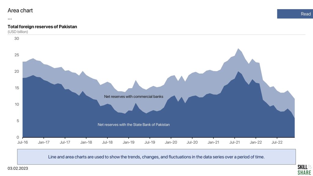
An area chart follows the same concept as a line chart, except that the area underneath the line is filled with colour of shade. An area chart is used to depict fluctuations in data over time while showing the composition of a variable in the total. See an example of an area chart below. Our presentation slide on area chart shows the total foreign exchange reserves of Pakistan. Using an area chart, we can split the total reserves into two categories; reserves with the State Bank and reserves with the commercial bank, and compare the trends of the two categories over time.
Histogram
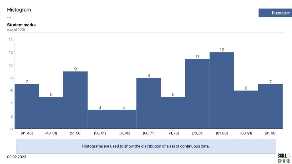
Histograms are used to show the distribution of a set of continuous data. The data is divided into intervals, or “bins,”, and the height of each bar corresponds to the number of data points that fall within the interval. Histograms are used to show the shape and spread of the data. For a histogram, the x-axis represents the class intervals while the y-axis represents the frequency of data
Let’s see an example of a histogram below: we have distributed the marks into different intervals and have mapped the number of students in each interval. So in our histogram example, there are seven (7) students who scored between the interval of 41 and 46, five (5) students who scored between 46 and 51. Meanwhile, the number of students who scored between 91 and 96 is also seven (7).
Scatter plot
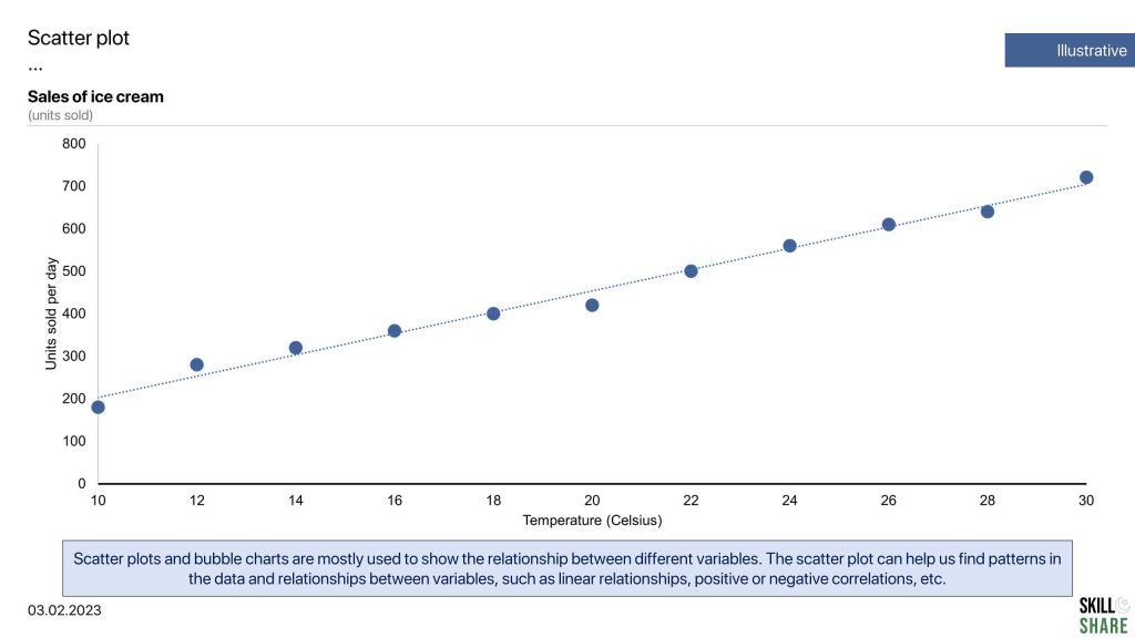
Scatter plots and bubble charts are mostly used to show the relationship between different variables. Scatter plots are used to understand the relationship between two variables, while bubble charts are used to identify the relationship between more than two variables.
The scatter plot maps specific data points as dots on a two-dimensional graph, with the x-axis representing one variable and the y-axis representing the other variable. The scatter plot can help us find patterns in the data and relationships between variables, such as linear relationships, positive or negative correlations, etc.
Take a look at the example of a scatter plot below. This scatter plot chart explores the relationship between the number of ice creams sold at a certain shop at specific temperatures. Using this scatter plot, we can infer that the sales of ice cream increases as the temperature rises, therefore, sales of ice cream and temperature have a positive correlation.
Waterfall chart
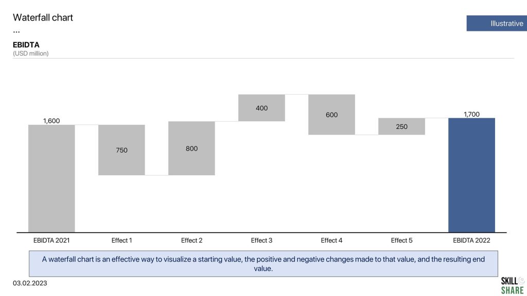
Waterfall charts are most commonly used in consulting presentations. In fact, there is rarely any consulting presentation that does not have a waterfall chart. Waterfall charts are an effective way to visualize a starting value, the positive and negative changes made to that value, and the resulting end value. In a waterfall chart, the first column is the starting value, and the last column is the end value. The floating columns between them are the contributing positive or negative values. The first column in a waterfall chart represents the initial value, while the last column represents the ending value. The positive and negative values are represented by the floating columns between them.
Here is an example of a waterfall chart. Looking at our example, you can see how the waterfall chart is being used to show bridges between financial figures. Here we compare the EBIDTA of 2021 to the EBITDA of 2022. And we can see how each stage affected the final EBIDTA of 2022.
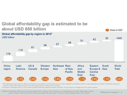
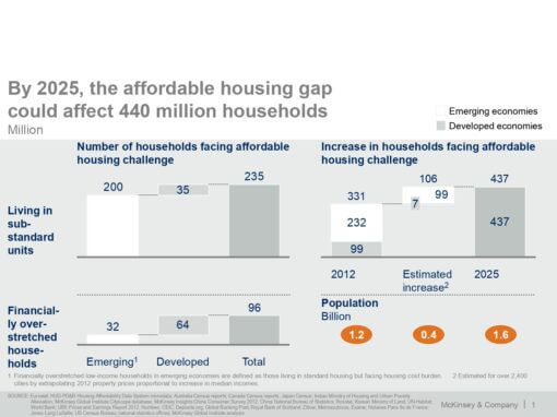
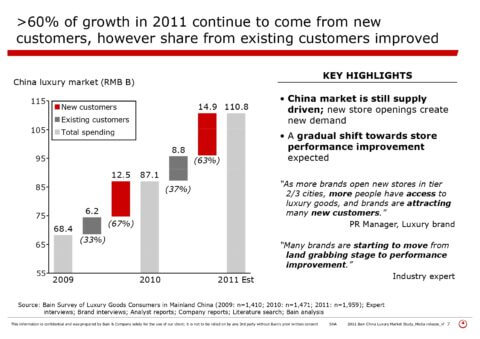
Examples of good charts
Choosing the right chart is important, but equally important is the way in which you format and present it. For this, we have written a detailed guide on how to format your charts to convey insights effectively. Additionally, you can also check our detailed guide on how to create consulting presentations, where you’ll observe that almost every consulting slide deck contains charts. For reference, here is an example of how consulting firms create insightful charts:
In addition, another effective way to learn how to create good charts is to see examples of good charting. Below are some examples of charts from some consulting slides from MBB consulting firms, including McKinsey & Co., Bain & Company, and Boston Consulting Group.

Pingback: The Golden Rule of Slide Writing: Action Title & The Body