The world today has become data-driven. Governments, business entities and corporate firms base their decisions on evidence & data, and hence, collect a lot of data to support their decision-making process. Often, historical data spanning several years is collected to make informed decisions. However, raw data can be difficult to work with as it lacks organization and structure, making it hard to analyze and interpret. It is challenging to identify trends and patterns from a large volume of data, especially in absence of context, which is necessary for making informed decisions. Therefore, consultants and policy advisors must synthesize data and communicate their findings effectively to businesses and governments. The most effective way is to use graphs and charts, that provide a visual representation of data and make it easier to understand and analyze.
Graphs and charts can help you tell a story with your data. It can help identify trends and patterns and make complex information simpler and more understandable. However, it is essential to choose the right chart for your data and presentation, which obviously can be a bit tricky.
While we have written a comprehensive guide on how to choose the best graph for your specific needs, in this article we are going to focus on visualizing time-series data: data spanned over several years.
Using our guide, we have assessed that the best way to depict time-series data is by using a line chart, a column chart, or a stacked version of either of these charts (to incorporate composition). If this sounds confusing, don’t worry, we’ll elaborate ahead.
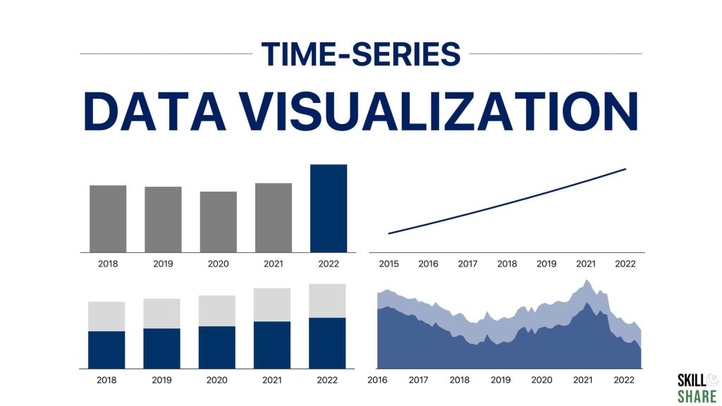
Structure of this guide
This article will begin by briefly explaining what column and line charts are and present how and when these charts are used. It will also cover the stacked charts to explain the key difference and cases where a stacked column chart or a stacked area chart (alternative to line chart) are used. We will mention some examples of where these charts can be used and will plot both of these charts out to make sure you fully understand their use case & presentation.
Also, before you begin, make sure you understand how to format the graph or chart properly to convey key insights effectively.
Column chart
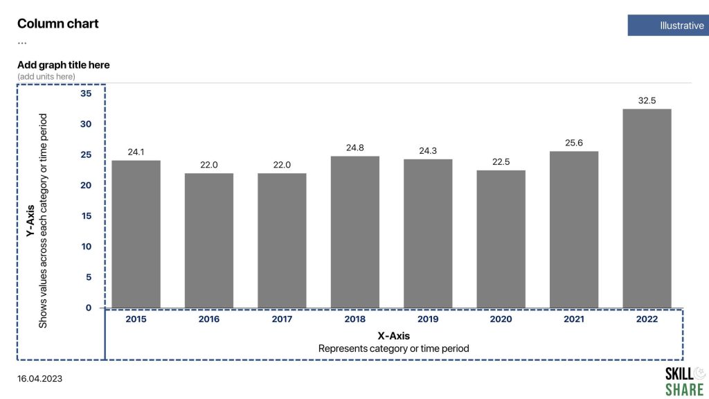
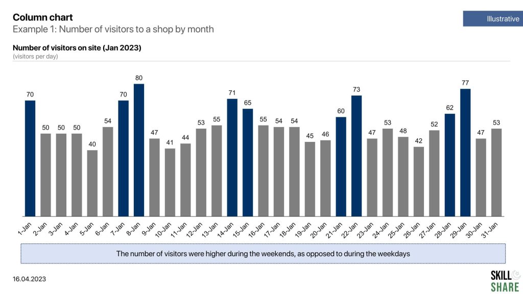
Column charts are useful in presenting comparisons between different categories or groups, identifying trends over time and highlighting differences in data distribution. In bar graphs or column charts, the length of the bar is proportional to the size of the data that it represents.
For a typical column chart, the x-axis represents categories while the y-axis represents values across those categories. In case of time-series analysis, the x-axis would represent the time period (month, year) while the y-axis represents values across each time period.
Column charts can be used to plot a variety of data types, including quantitative and categorical data. Quantitative data refers to numerical data, such as sales revenue, temperature, or population. Categorical data refers to data that falls into discrete groups, such as products, ages, or geographic regions.
Stacked Column Chart
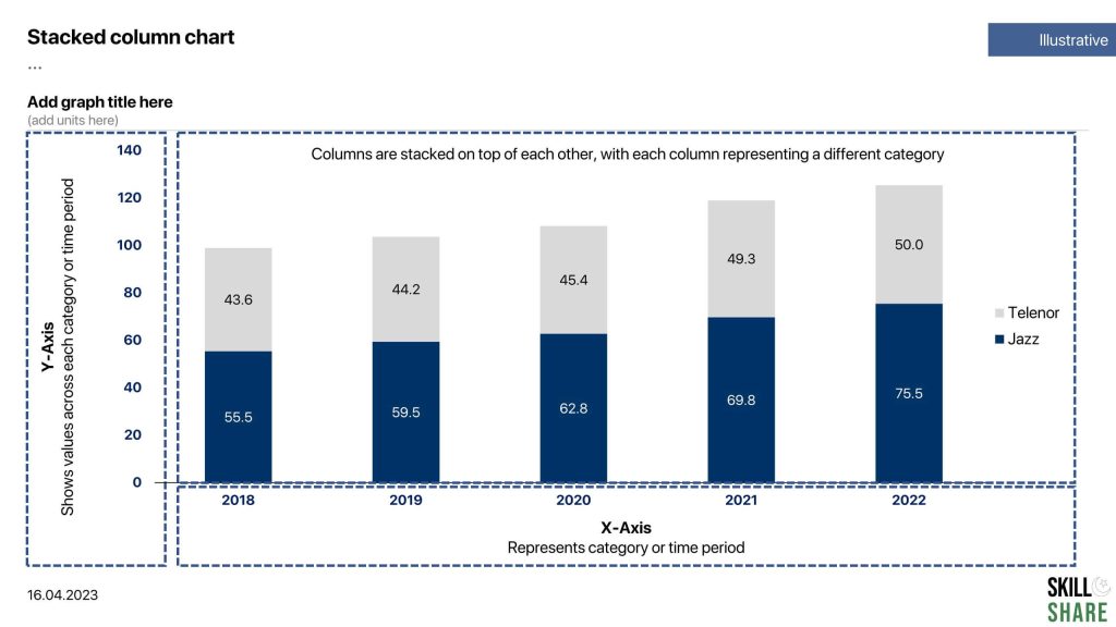
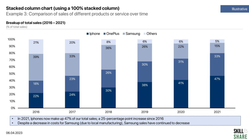
A stacked column chart is a type of chart that is used to display the relative proportions of multiple categories as a whole. The stack column chart follows the same fundamentals as the column chart, except that the columns are stacked on top of each other, with each column representing a different category. The height of each stacked column represents the total value of the category, and the different parts of the stacked column represent the relative proportion of each subcategory within the category.
Stacked column charts are often used to compare the contribution of different categories to a whole, or to show how a whole is broken down into different subcategories. They are also useful for showing changes over time or across different categories, as they allow you to easily see how the proportions of the subcategories change over time or across categories.
Line chart
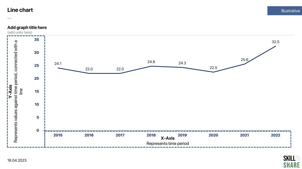
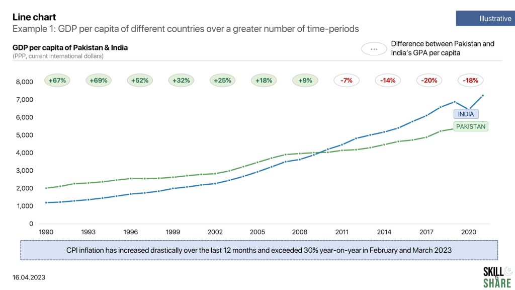
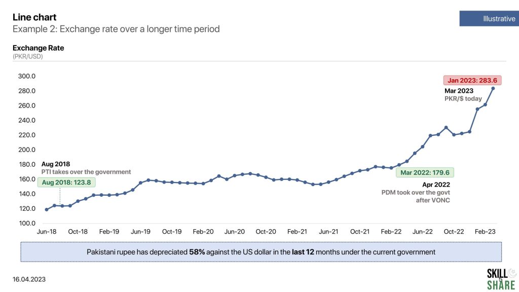
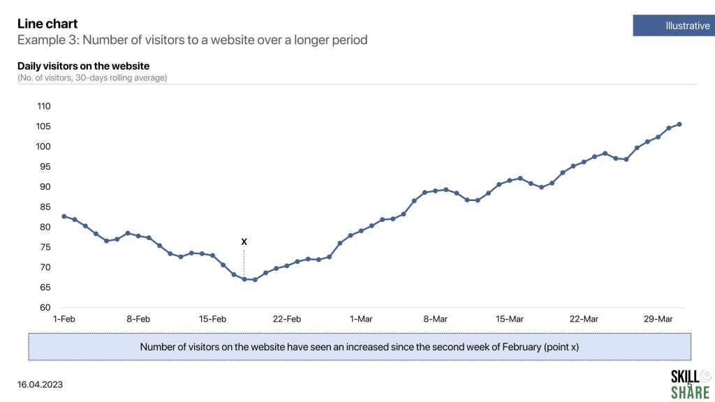
Line and area charts are used to show the trends, changes, and fluctuations in the data series over a period of time. They are useful for displaying trends or patterns in data that changes continuously over time, such as stock prices, a country’s GDP per capita, or changes in a country’s foreign exchange reserves. Line charts can have one or more lines, depending on the number of data series being displayed. Each line represents a different data series, and is often color-coded for easy differentiation. The x-axis of a line chart typically represents time or categories, while the y-axis represents the value or quantity being measured.
If the area under the line chart is filled with some colour, the chart is called as an area chart.
Stacked area chart
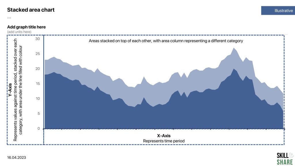
A stacked area chart is a type of graph that shows how different components contribute to the whole over time. Like a regular area chart, the stacked area chart displays data using two axes, with the x-axis representing time and the y-axis representing the values being measured. However, in a stacked area chart, the area under the curve is divided into segments or layers, with each layer representing a different component or category. The layers are stacked on top of each other, with the lower layers representing the values of the components that make up the higher layers.
The stacked area chart is particularly useful when you want to compare the contribution of different components to the whole over time. It is often used to show trends in data that has multiple categories, such as the performance of different products or the breakdown of expenses in a budget.
Examples of time-series data visualization
There are literally thousands of different indicators and data points that you can plot on column charts and line charts. However, sticking to our focused area of visualizing time-series data, we have chosen the following examples to help you understand use cases of these charts effectively.
Some examples of data that can be plotted through a column chart:
- Number of visitors to a website by day, week or month
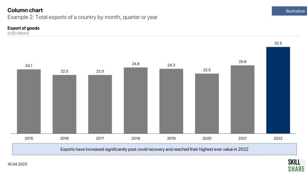
- The total exports of a country by month, quarter or year
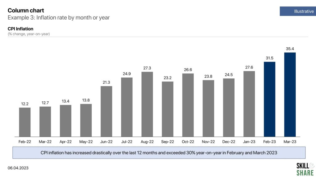
- Inflation rate by month or year
Some examples of data that can be plotted through a stacked column chart:
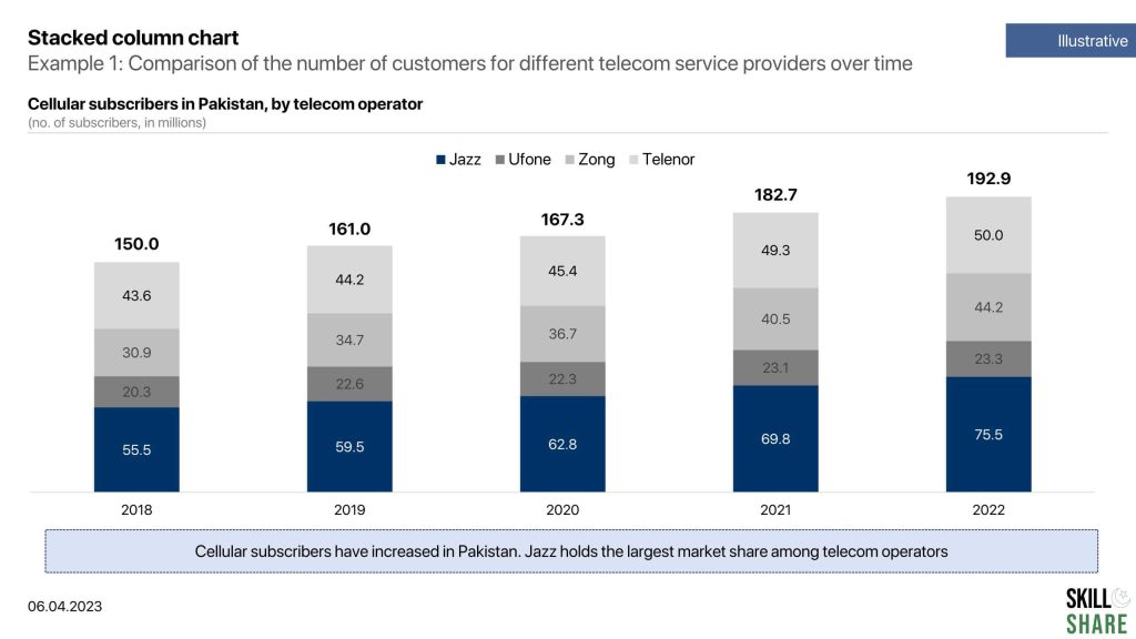
- Comparison of the number of customers for different telecom service providers over time
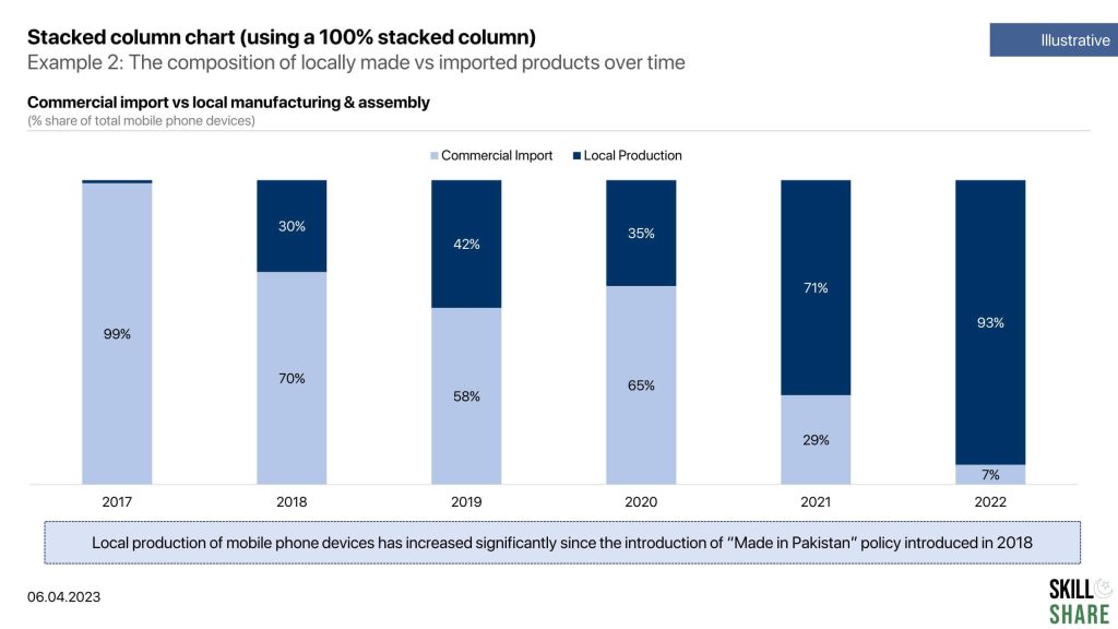
- The composition of locally made vs imported products over time
- Comparison of sales of different products or services over time
Some examples of data that can be plotted through a line chart:
- GDP per capita of different countries over a greater number of time-periods
- Exchange rate over a longer time period
- Number of visitors to a website over a longer period
Some examples of data that can be plotted through a line chart:
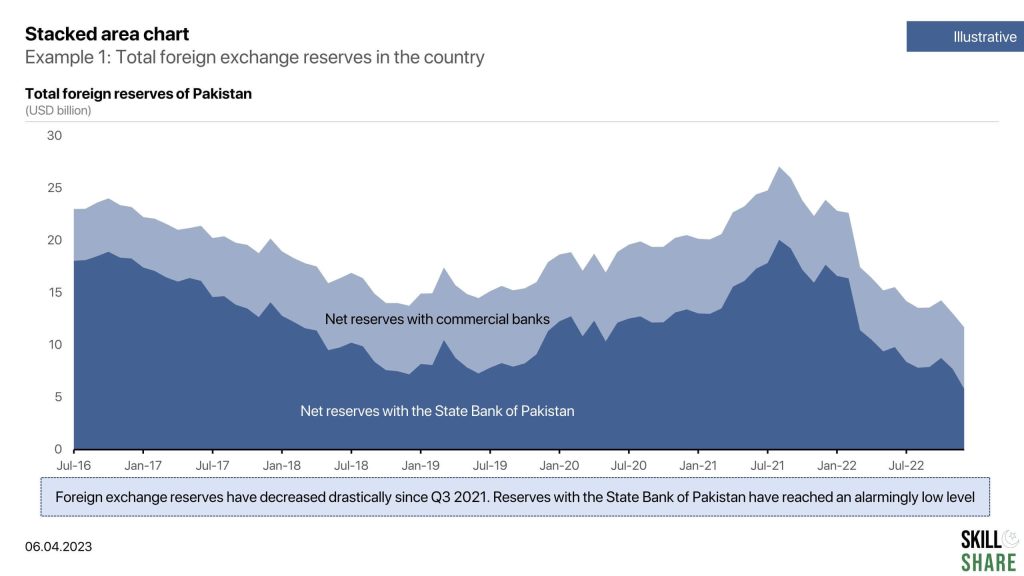
- Total foreign exchange reserves with a country
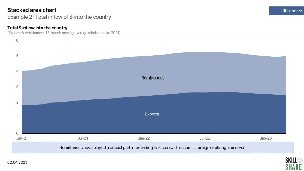
- Total inflow of $ into the country
Examples of column chart
Examples of stacked column chart
Examples of line chart
Examples of stacked area chart
